In this post we look at Joseph Müller-Brockmann's classic text, Grid Systems in Graphic Design, and apply some of its key concepts to presentation design, most notably, how readability of text plays a central part in constructing the grid. We also take a look at some examples.
Background
The grid is the central organizing structure for any design. Newspapers, brochures, posters, websites… grid systems are equally useful for designing presentation slides. A uniform system of columns and rectangles provides a framework on which content — text, images, and illustrations — may be organized. Such a grid system is a useful aid to the designer for resolving design problems like placement and alignment.
While the grid stays invisible to the audience, the resulting layout provides consistently placed and aligned elements and helps each slide in a presentation deck look uniform. This repetition and visual consistency creates expectations in the viewer and subtle visual cues that facilitate communication by the presenter and understanding by the audience.
Have you ever seen a presentation in which the header changes position slightly from one slide to the next, or content strays into margin areas? Audiences are sophisticated and can sense when a presentation’s own grid system has not been respected, even if they might not be able to explain exactly why something seems “off”. A failure to adhere to the grid can potentially distract, frustrate, and even antagonize an audience. When elements drift from one slide to the next or seem to be haphazardly placed, an audience might start to question a presenter’s attention to detail, organization skills, and even his or her credibility.
With presentation design in mind, I recently re-read the classic Grid Systems in Graphic Design by Joseph Müller-Brockmann (1914-1996). By way of background, Müller-Brockmann was a leading practitioner of Swiss Style and the European design consultant for IBM. (On a personal note, my own father worked for IBM as a consultant and salesman from the ’50’s through the ’80’s, and growing up I became familiar with this kind of corporate design aesthetic, with decades’ worth of dad’s corporate journals, manuals and other materials piled up in our home library.)

Originally published in 1981, Grid Systems in Graphic Design primarily considers layout systems of printed materials. On review, it is easy to see that many of its core principles apply equally to presentations, both on-screen and print. Presentations lend themselves particularly well to grid systems. In PowerPoint, slide templates based on the grid can easily be created to ensure consistency throughout.
Readability: type size, column length, leading
How do we construct a suitable grid system to lay out a presentation? How many columns should we use? How wide should our columns be? Grid Systems in Graphic Design starts by establishing some baseline principles for readability. For Müller-Brockmann, readability is key. “Anything that might impair the rhythm of reading should be scrupulously avoided,” the author writes. “Every difficulty standing in the reader's way means loss of quality in communication and memorability… The reader should be able to read the message of a text easily and comfortably.“
So how can presenters achieve maximum readability? For Müller-Brockmann, the answer starts baseline typographic principles. He begins this inquiry by reviewing printed paper sizes, systems for measuring type, and classic typeface alphabets (his description of point sizes for measuring type is particularly edifying).
Having laid out these basics, he moves on to further elaborate on rules for sizing type, line length, and leading (i.e., the vertical distance from line to line). Müller-Brockmann does not prescribe an optimal point size to be used when determining type size. He notes that printed matter is generally read with the eye at a distance of 30-35 centimeters, and that the size of the type should be calculated with this distance in mind. He advises that text should be “agreeable” to read at this distance. “Both too small and too large a type costs the reader an effort. He tires more rapidly.”
In design school we learned as a rule of thumb that body copy should generally be 8-10 points in size. In the presentation context, such a rule of thumb doesn’t really work as a practical matter. Laying out text on a presentation slide is much different than laying out type in a brochure. Point sizes are fixed measurements, like centimeters or inches. Slides are designed to be scaled up or down to the size of whatever format on which they may be produced. If we scale a fixed length, say an inch, up or down in size, e.g., up using a giant screen using a projector or down to fit a piece of printer paper, does the inch as a measurement continue to be meaningful (other than relative to its own scale)?
When setting up a new document in PowerPoint, generally people choose an aspect ratio, typically 16:9 or 4:3, without any regard to the dimensions of the document in inches or centimeters. It would probably surprise most users of PowerPoint that the default size for a 16:9 presentation is 13.33” by 7.5”, and for a 4:3 presentation it is 10” by 7.5”. These are not standard paper sizes, and they become irrelevant when the presentation is scaled up or down in size.
As an aside, a lot of designers miss that PowerPoint is a powerful layout tool. Presentation dimensions may be customized in PowerPoint to fit a standard letter or legal paper size. The size of a presentation in PowerPoint can be customized under File > Page Setup; you can also change the page orientation from landscape to portrait here, which creates interesting possibilities for various printed layouts like corporate reports.
I have heard different rules of thumb for determining the right point size for presentations. I once worked for a partner at a consulting firm who required that reports to clients use font sizes no smaller than 14 points. Guy Kawasaki recommends that a PowerPoint presentation should contain no font smaller than 30 points. Guy also recommends determining the minimum point size by taking the age of the oldest member of the audience and dividing it by two. In her book slide:ology, Nancy Duarte recommends testing for readability by viewing the PowerPoint file in slide sorter view and looking at the slides at 66% size. To test the readability of type from the back of a conference room, Nancy also advises standing the number of feet from your computer screen that the screen measures diagonally in inches. David Paradis has developed various tables to determine the right font size that take into account aspect ratio, screen screen, and distance from the screen (these may be found here).

This presenter does a good job of maximizing the readability of this slide for an auditorium of this size. Do you think you could read this slide from the back of this room? Notice some text in the header that is laid out in columns — it is a bit harder to read at a distance.
At the outset of every project, I ask my client if he or she intends their presentation to be on-screen or printed. If on-screen, I try to ascertain the aspect ratio of the screen to be used, screen size, and how far away the audience will be. I also consider age of the audience as a proxy for visual acuity. If the presentation is to be printed I try to determine the best printed size for them, usually letter or legal size, and set up the dimensions of the document to actual size so there is no scaling up or down of the document at the time of production.
Once we have established a type size for our project that an audience will be comfortable with, we can consider column length, which can now be easily determined. “According to a well-known empirical rule there should be 7 words per line for a text of any length. If we want to have 7-10 words per line, the length of the line can be readily calculated,” Müller-Brockmann explains. With regard to leading, he warns that lines that are too narrowly or too widely set distracts and fatigues the reader, thereby impairing reading. He accompanies his explanation with a series of illustrated examples of to demonstrate leading that is too close, too wide, and just right.
Constructing the grid
Having determined the right size font, line length, and leading, we can proceed to constructing the grid. The right grid system will depend on the amount and nature of the content to be accommodated. “Before the type area can be determined, the designer must know how much text and illustrative matter must be accommodated in the printed work he has to design and of what nature it is,” the author writes. “Just as every problem is novel and different from others, so the grid must be conceived afresh every time so as to meet requirements."
Following these basic rules, he then provides examples of various layouts using different grid systems on A4 format paper — 2 columns by 4 rows, 4-by-5, and 4-by-8. He then considers and provides some tips on laying out photos and illustrations in grid systems. Next he provides many real-life examples of how various grid systems have been deployed in various contexts. Finally, he ends the book by considering the grid in corporate identity, how it may be used in three-dimensional design, and systems of order in ancient and modern times.
Examples
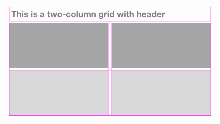
With all this in mind, there are many possibilities for grid systems to accommodate different presentation needs and content. PowerPoint's default slide masters provide templates for both one-column and two-column layouts; rarely will these accommodate the content for any given presentation without at least some tailoring.
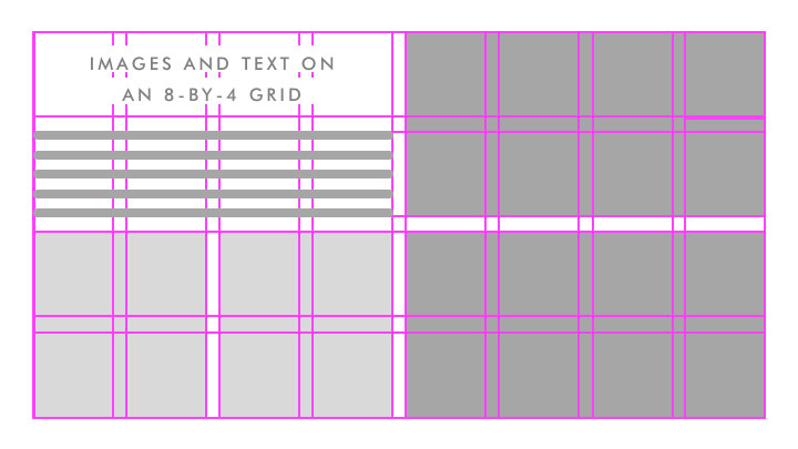
On one of my recent projects, the client, a luxury footwear company, wanted to include dozens of beautiful product shots in a presentation. We ended up using a grid system of 8 columns by 4 rows. Müller-Brockmann might call this a “fine-meshed” grid; the more fine-meshed the grid, the more flexibility it has to accommodate text boxes and images of various sizes. A grid system like this provides many design possibilities. Any image could be scaled up or down and/or cropped to fit any combination of row height and column width, or even extend from edge-to-edge for a full-bleed treatment. This particular presentation ended up resembling the brand’s product catalog, which was the desired effect.
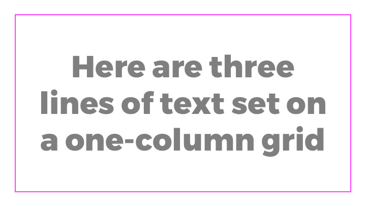
On the other end of the spectrum, I recently saw an educator give an effective presentation using a simple one-column grid with no header space for her content, which consisted of no more than a few words of text per slide, set in a bold display type for maximum readability.
There are many more variations. For more examples, Nancy Duarte’s slide:ology provides examples of three, four, and five-column grids, as well as a Fibonacci grid (link here).